Claude Is My New Design Partner
Design is the part of shipping an app that takes the most of my time, so lately Claude Design has become my go-to partner for web, mobile, and even thumbnails and banners. Here's how I got here, with a few things I actually shipped.
I’ll be honest: of everything that goes into shipping an app, design takes the most of my time. I’ve been writing code for over ten years, and I can get a screen to look the way I want. It just takes me a while. Spacing, color, what goes where, that long “why does this feel off” loop. I’d happily spend a whole afternoon nudging pixels until it finally felt right.
Lately that’s changed. Claude Design slowly became my design partner, and I don’t think I’m going back.
The tool I almost paid for
Before this, my go-to was impeccable.style. It got me to something okay when I had no idea where to start. I also came this close to trying ui.sh. It was open in a tab, basically one click from a paid plan. Then a few days later Claude Design showed up. Lucky timing: I never did pay for ui.sh.
Now the flow is simple. I say what I want in plain words, something like “a settings page with a profile header, a list of toggles, and a danger zone”, and I get back real, working UI. Not a mockup I have to build again, but something I can drop straight into the project, with good spacing and a layout that already makes sense. Then I just keep talking to it: “make the danger zone feel more serious”, “tighten up the spacing”, “this looks too plain, give it more personality.”
It’s the back-and-forth that gets me. What used to be an afternoon of fiddling is now a five-minute chat.
Mobile: from Expo to Flutter
Mobile was its own little story. I started on Expo (React Native) and gave it a real try over a few goes. In the end I tried Flutter instead, and honestly, I was impressed. What Claude Design gave me turned into the Flutter screen almost as-is. No fighting to make the screen match the idea; it just came out the way it looked in the design.
I might go back to Expo and React Native at some point. But for now, Flutter plus Claude is comfy enough that I don’t feel the need to switch.
It’s not just prototypes
The fun part is that some of this is already live, not just sitting in a design tab. holonesia.com shipped straight from what Claude Design made, and on mobile there’s Qalbi up on the Play Store.
There are a few more I built the same way. Those never became real apps though; they were more like playgrounds where I messed around in Claude Design to see how far I could push an idea. Here’s one, a tap-to-jump game I called Celo Dash:
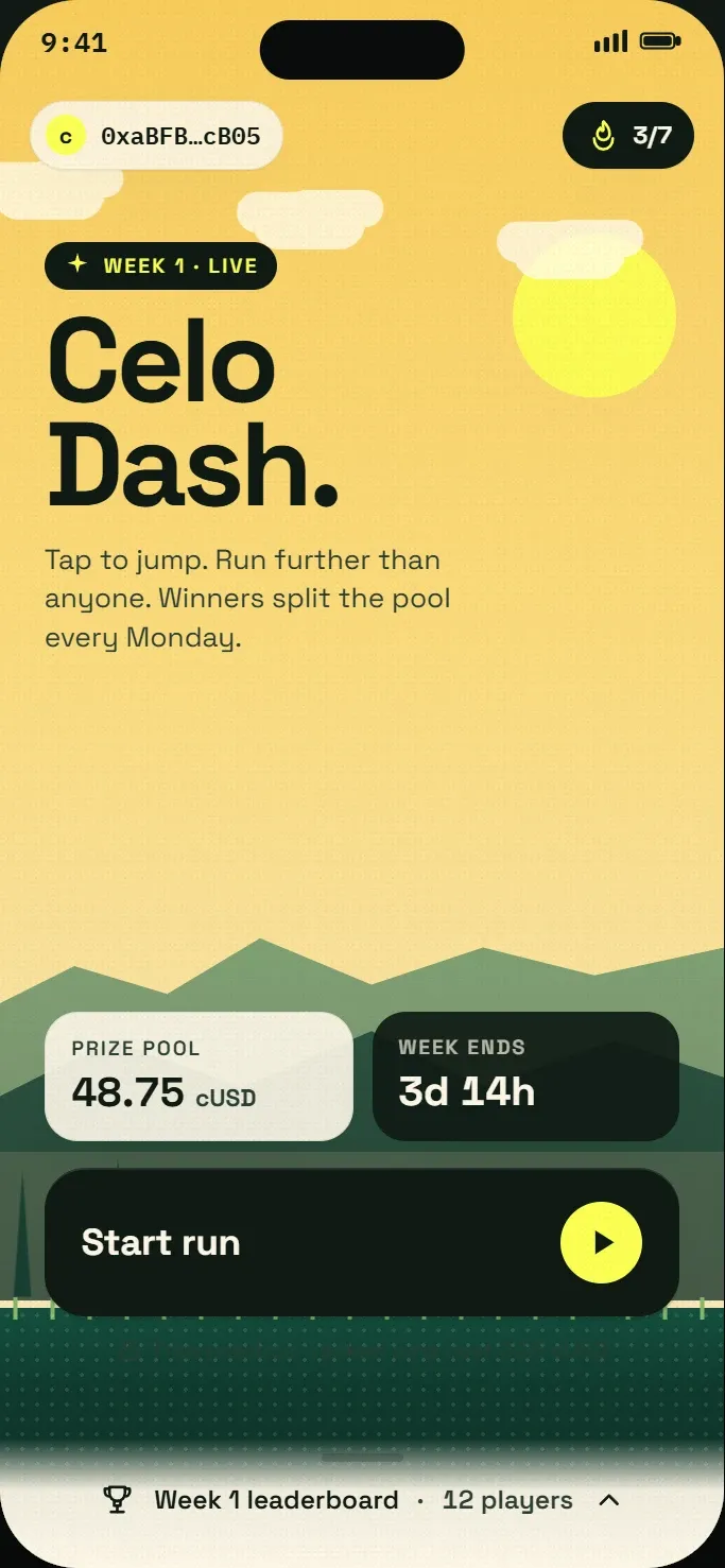
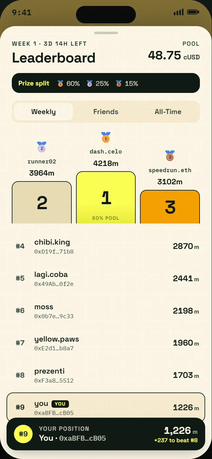
Celo Dash, one of my Claude Design playground ideas. Never shipped, just me seeing how far an idea could go.
It does way more than UI
Here’s what surprised me most: Claude Design isn’t just for web and mobile UI/UX. I’ve used it for thumbnails, banners, even logos, and the results are really good.
Logos are the one spot that’s still a bit hit or miss. That’s the part I hope gets better over time. But everything else? Better than I’d ship on my own, and faster than I’d get there alone.
A partner, not a magic button
I want to be clear though: it’s not magic, and I don’t treat it like it is. The first version is rarely the final one. Sometimes it plays too safe and dull, sometimes it pushes an effect too far. The taste, the “no, that’s not it” gut check, that part is still on me.
But that’s exactly why “partner” is the right word. I bring the calls and the direction; Claude brings the speed and the thousand tiny choices I’d otherwise grind through one by one. We meet in the middle, and we get there a lot faster than I would alone.
Wrapping up
The design stage used to be the slow part of any project. Now it’s almost my favorite, because I can actually play, trying five ideas in the time it used to take me to pick one.
If design is the part that always drags for you, give this a real try. Stop thinking of it as “make me a UI” and start treating it like a chat with a fast, tireless design partner. That small shift in how I think about it changed everything for me.
P.S. Fitting enough, this post was written with AI too.